
Choosing Colour Palettes for North-Facing Rooms
Why North Light Changes Everything
North-facing rooms get the short straw when it comes to sunlight. Direct sun rarely lands on them, so what you get instead is soft, indirect light with a distinctly cool, blue-grey cast. It is flattering in its own way — no glare, no harsh shadows, brilliant for reading and for anything you want to look calm — but it plays havoc with colour.
The practical consequence is simple: colours in a north-facing room read cooler and darker than they did in the shop. A tester pot that looked creamy on the shelf can turn faintly grey on your wall, and a soft grey that looked elegant in a bright hallway can go flat and slightly dingy once it is up in a north-facing bedroom. The trick is not to fight the light but to warm it up, so the room feels balanced rather than chilly.
Test Samples Like You Mean It
Never commit to five litres on the strength of a two-centimetre smear of paint. North light shifts through the day, and a colour that works at 9am may look entirely different at 4pm in November.
- Paint samples onto large sheets of card — A2 at minimum, two coats, allowed to dry fully. Colour deepens and shifts as it cures.
- Test on at least two walls: the one beside the window and the one opposite behave completely differently.
- Tape the sheets up at eye level and move them around the room over the course of a few days.
- Leave them for at least 48 hours, checking in the morning, mid-afternoon and evening.
- Look at them with your actual lamps on, not just daylight.
- Hold them against fixed elements — flooring, worktops, tiles, your sofa — because those are not changing.
If you can bear it, paint a patch straight onto the wall as well. Card is useful for comparison, but a patch on the wall shows you how the colour sits next to the window frame and skirting without a distracting white border.
Warm Whites and Neutrals That Hold Their Own
Start by choosing whites with warm undertones. Look for descriptions such as almond, oatmeal, soft linen or chalky cream, and check whether the base leans yellow, pink or red rather than blue or grey. A white with a drop of pink in it is quietly brilliant in north light — it softens the blue cast without turning the room peach.
Pure brilliant white is best avoided on walls here. It tends to read cold and slightly grey, and it makes every shadow look sharper. Save it for the inside of cupboards if you must use it at all. For ceilings, a warm off-white keeps the room feeling open without going icy.
Mid-Tones That Bring Warmth Without Shouting
Once you move past neutrals, aim for colours with a warm base: soft ochre, clay pink, mushroom with a reddish undertone, olive-green, muted terracotta, warm stone. These absorb the coolness of the light and give it something to work with, and they look rich rather than muddy in the corners.
In small north-facing rooms, a strong colour used on one wall only can leave the others looking pale and disconnected. Wrapping all four walls in the same warm mid-tone — or keeping the colour within a shade or two across walls and ceiling — often makes a compact room feel more generous, because the eye is not stopping at hard edges. If you want a lighter feel, take the colour up over the ceiling in a slightly diluted version rather than switching to brilliant white.
Tones That Often Disappoint
Some colours are simply harder work in a north-facing space. Approach these with caution:
- Cool greys with a blue or violet base, which tend to look grey-blue on the wall rather than soft grey.
- Stark, brilliant whites, which can read as dingy in low light.
- Pale, chalky blues and cool pastels, which double down on the light's own coolness.
- Deep charcoal and near-black, which soak up light and can make a small room feel like a box.
None of these are forbidden. If you love grey, look for a greige with a warm base and balance it with warm textiles, timber and lighting. If you want blue, choose one with a green or grey-green edge rather than a violet one, and keep it to a smaller area.
Balancing Walls, Trim, Ceiling and Artificial Light
Your paint scheme is only half the story. In a north-facing room, finishes and lighting do the rest of the work.
- Finishes: matt paint is forgiving and velvety but swallows light. A mid-sheen or eggshell on walls bounces a little more around dark corners — useful in a small room with one small window.
- Trim: keep skirting, architraves and doors in the same warm white family as the ceiling so the edges stay soft.
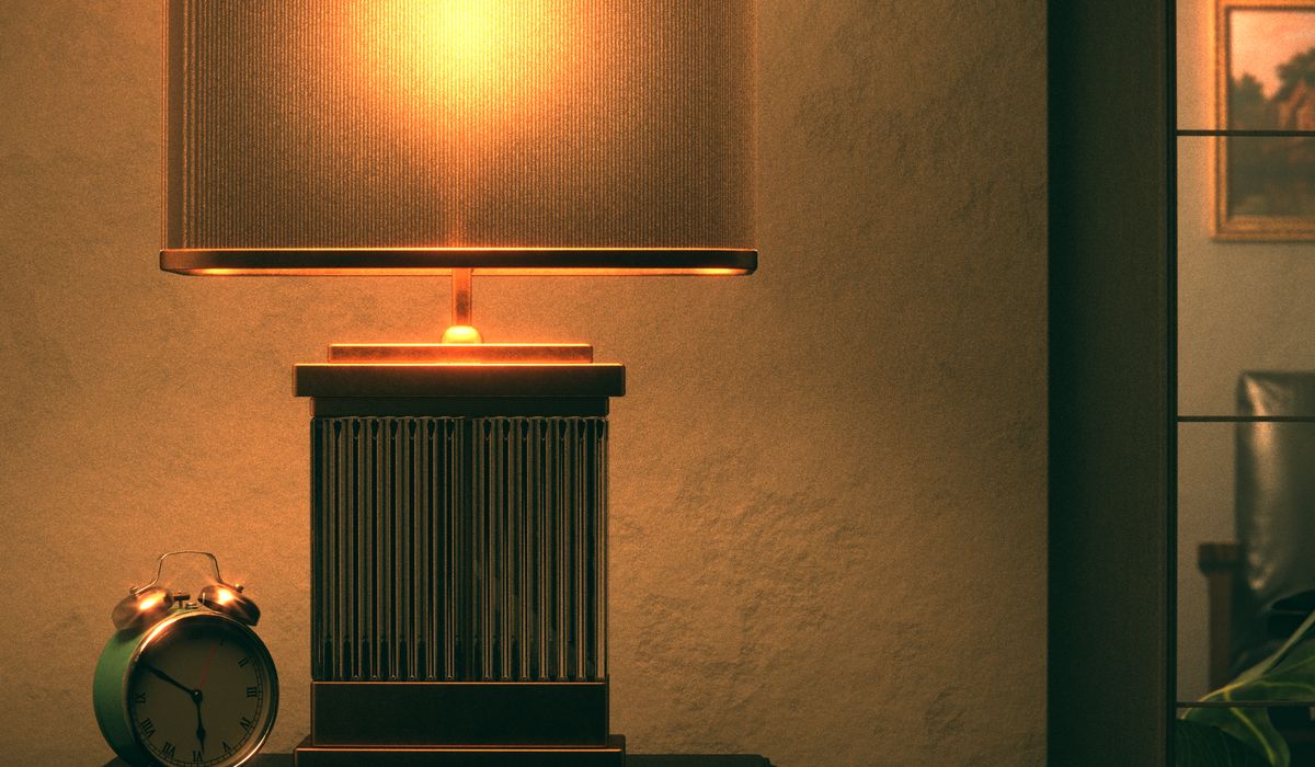
- Bulbs: choose warm white, around 2700K. Cool-white LEDs will undo every warm tone you have carefully chosen.
- Layering: two or three light sources — a floor lamp, a table lamp, a wall light — beat one overhead fitting every time, especially in winter.
Get the samples up, live with them for a few days, and trust your eye over the name on the tin. A north-facing room can be the calmest, most restful space in the house — it just needs colours that warm it up rather than echo its cool light back at you.

4 Comments